|
|
|
|
|
|
|
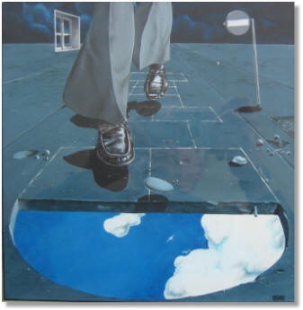
This dates back to 1977, a commission for Absolu, a top-range girlie magazine that had belonged to the late Claude François before being sold to a variety of successive investors. I contributed for years, and started when the singer still owned it. I walked past him several times in the stairs of his Boulevard Exelmans office building in Paris. The crowd of girls outside, which I had to get through when I came delivering my work, always amazed me. They'd stay hours on end out there, hoping to see their idol, even from a distance. As for me every time the magazine changed hands I had to go through the ordeal of demonstrating my competence again by showing my entire portfolio and convince the newly-hired art director I could do the job. These two were very interesting commissions (moneywise, too, yes), they consisted in illustrating a two-issue article about games and how they reflect the player's personality through the associations they reveal. So I developed my own connections with games I had in mind... |
|
|
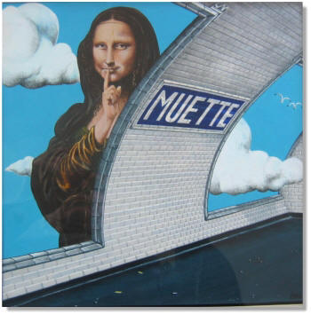
The second part of the article
spoke about how the Mona Lisa was a card in a best-selling game that you
could associate with a variety of situations... So I thought this one was an
opening of sorts...
|
 |
|
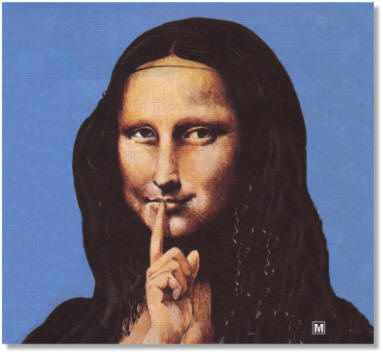 |
I was so proud with the result I isolated her from the setting... | |
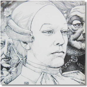 |
This is what is referred to as a starter, ie, a
small piece of illustration for a short article. It gives visual rhythm in a
page. This was Fellini's Casanova. Drawing Sutherland was a
challenge, so regular his features were at the time. There had to be as few
strokes as possible in the actual process of drawing. The character to the
right and the female figure to the left provided a nice relief, with more
contrasted, older, deeper lined faces. I labored on this for hours, and finally realized that the contrast was no doubt initially meant that way by the Master to emphasize the hero's incredible vitality and indifference. |
|
|
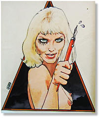
This was much easier to do, and more fun, too. Xaviera Hollander --this woman-- was the first Madame to really hit a publishing mother lode by writing very clearly about her business. This was contemporary with the release of Kubrick's Clockwork Orange, with its famous poster showing Malcolm McDowell in punk make-up, flaunting a yard-long knife. Hence the pastiche. There was no violence in Hollander's novels. Only sex.. Quite a coincidence, sometimes I did translation jobs for Editions Lattès, and I happen to have translated one of her novels into French. This is a small world... |
 |
|
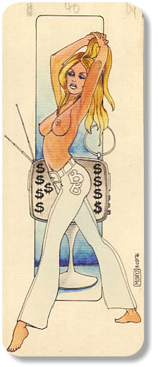 |
Our national BB. Magazines and newspapers went berserk at the time (76): Brigitte had dared sell her image to admen for a famous women's pants manufacturer. The pants were Elastiss-type, very tight at the bottom and flaring on the feet. Beautiful. Of course Absolu joined the chorus, albeit with a certain humorous distance, and I was asked to illustrate the job. Tough. I came across a series of photos shot at her St Tropez home in scanty outfits, and used these, but systematically ended up with a midget Brigitte with no allure at all, nothing like the fluid grace that characterized her ballet-dancer body. That is when I found out that when working from photos you have to lengthen the legs of the figure, otherwise it looks nothing... The pencil markings are editorial. |
|
|
|
|